Overview
Teaching: 60 min
Exercises: 20 minQuestions
How can I explore my data by visualization in R?
Objectives
To be able to use ggplot2 to visuzlize your data
To understand the basic grammar of graphics, including the aesthetics and geometry layers, adding statistics, transforming scales, and coloring or panelling by groups.
A Brief Intro
Exploratory data analysis emphasizes visualization as the best tool to understand and explore our data—both to learn what the data says and what its limitations are.
There are three main plotting systems in R, the base plotting system, the lattice package, and the ggplot2 package.
Every R user should be acquainted with base graphics (at some point, you’ll encounter a base graphics plot you need to modify), but we’re going to skip base graphics to focus entirely on learning visualization with ggplot2, which allows you to create more informative plots with less time and effort.
Note, ggplot2 works exclusively with dataframes, so you’ll need to get your data tidy and into a dataframe before visualizing it with ggplot2.
The best up-to-date reference for ggplot2 is the ggplot2 online documentation. More advanced information can be found in the books ggplot2: Elegant Graphics for Data Analysis by Hadley Wickham (Springer, 2010) and R Graphics Cookbook by Winston Chang (O’Reilly, 2012).
ggplot2 is built on the grammar of graphics, the idea that any plot can be expressed from the same set of components: a data set, a coordinate system, and a set of geoms–the visual representation of data points.
The key to understanding ggplot2 is thinking about a figure in layers. This idea may be familiar to you if you have used image editing programs like Photoshop, Illustrator, or Inkscape.
Exploring Data Visually with ggplot2 I: Scatterplots and Densities
First, we need to load the ggplot2 package with R’s library() function.
We’ll use the require() function to check whether ggplot2 is already installed.
if (!require("ggplot2")) install.packages("ggplot2")
Loading required package: ggplot2
library(ggplot2)
First, we’ll use ggplot2 to create a scatterplot of nucleotide diversity along the chromosome. Because our data is window-based, we’ll first add a column called position to our dataframe that’s the midpoint between each window:
d$position <- (d$end + d$start) / 2
ggplot(d) + geom_point(aes(x=position, y=diversity))
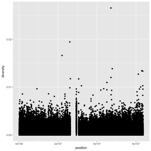
There are two components of this ggplot2 graphic: the call to the function ggplot(),
and the call to the function geom_point(). First, we use ggplot(d) to supply this plot with our d dataframe.
Second, we add layers to our plot. Note, that to add a layer, we use the same + operator that we use for addition in R.
We add geom_point() as a layer because we want points to create a scatterplot. geom_point() is a type of
geometric object (or geom in ggplot2 lingo). ggplot2 has many geoms (e.g., geom_line(), geom_bar(),
geom_density(), geom_boxplot(), etc.). RStudio provides a really useful cheat sheet, which, among other things,
shows different geometric objects.
Geometric objects have many aesthetic attributes (e.g., x and y positions, color, shape, size, etc.).
The beauty of ggplot2s grammar is that it allows you to map geometric objects’ aesthetics to columns in your dataframe.
In our diversity by position scatterplot, we mapped the x position aesthetic to the position column, and the y position to the diversity column. We specify the mapping of aesthetic attributes to columns in our dataframe using the function aes().
Note, that aesthetic mappings can also be specified in the call to ggplot()—geoms will then use this mapping:
ggplot(d, aes(x=position, y=diversity)) + geom_point()
Challenge 1
While ggplot2 chooses smart labels based on your column names, you might want to change this down the road. ggplot2 makes specifying labels easy: simply use the
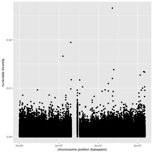
xlab(),ylab(), andggtitle()functions to specify the x-axis label, y-axis label, and plot title. Change x- and y-axis labels when plotting the diversity data with x label “chromosome position (basepairs)” and y label “nucleotide diversity”.Solution to challenge 1
ggplot(d) + geom_point(aes(x=position, y=diversity)) + xlab("chromosome position (basepairs)") + ylab("nucleotide diversity")
Notice the missing diversity estimates in the middle of this plot. What’s going on in this region? ggplot2’s strength is that it makes answering these types of questions with exploratory data analysis techniques effortless. We simply need to map a possible confounder or explanatory variable to another aesthetic and see if this reveals any unexpected patterns. In this case, let’s map the color aesthetic of our point geometric objects to the column cent, which indicates whether the window falls in the centromeric region of this chromosome
ggplot(d) + geom_point(aes(x=position, y=diversity, color=cent))
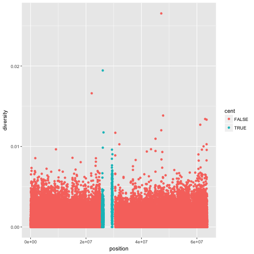
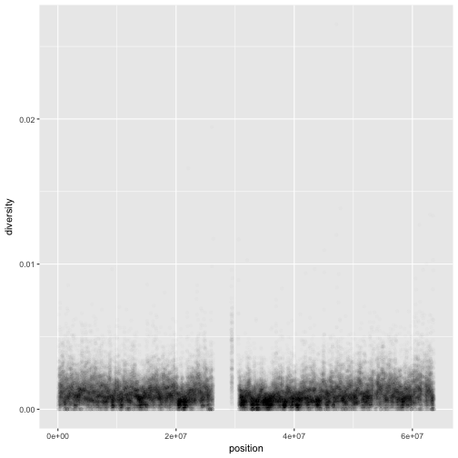
One problem with our plots is the degree of overplotting (data oversaturating a plot so as to obscure the information of other data points). We can’t get a sense of the distribution of diversity from this figure everything is saturated from about 0.05 and below. One way to alleviate overplotting is to make points somewhat transparent (the transparency level is known as the alpha):
ggplot(d) + geom_point(aes(x=position, y=diversity), alpha=0.01)
Note
There’s a subtlety here that illustrates a very important ggplot2 concept: we set alpha=0.01 outside of the aesthetic mapping function aes(). This is because we’re not mapping the alpha aesthetic to a column of data in our dataframe, but rather giving it a fixed value for all data points.
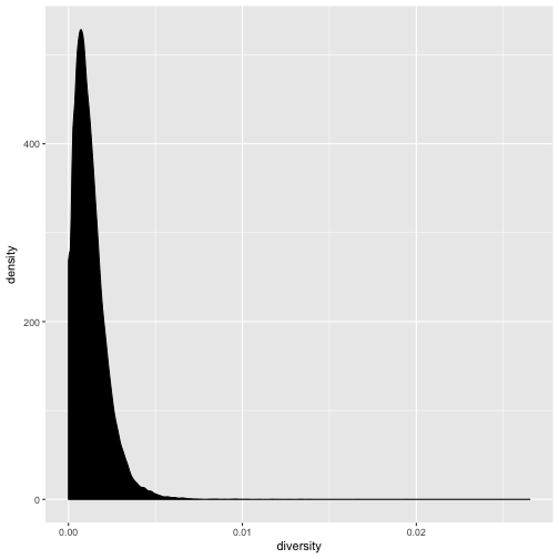
Let’s now look at the density of diversity across all positions. We’ll use a different geometric object,
geom_density(), which is slightly different than geom_point() in that it takes the data and calculates
a density from it for us:
ggplot(d) + geom_density(aes(x=diversity), fill="black")
We can also map the color aesthetic of geom_density() to a discrete-valued column in our dataframe,
just as we did with geom_point(). geom_density() will create separate density plots, grouping data
by the column mapped to the color aesthetic and using colors to indicate the different densities.
To see both overlapping densities, we use alpha to set the transparency to 0.4:
ggplot(d) + geom_density(aes(x=diversity, fill=cent), alpha=0.4)
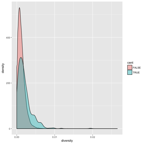
Immediately we’re able to see a trend that wasn’t clear by using a scatterplot: diversity is skewed to more extreme values in centromeric regions. Again (because this point is worth repeating), mapping columns to additional aesthetic attributes can reveal patterns and information in the data that may not be apparent in simple plots.
Exploring Data Visually with ggplot2 II: Smoothing
Let’s look at the Dataset_S1.txt data using another useful ggplot2 feature: smoothing. We’ll use ggplot2 in particular to investigate potential confounders in genomic data. There are numerous potential confounders in genomic data (e.g., sequencing read depth; GC content; mapability, or whether a region is capable of having reads correctly align to it; batch effects; etc.). Often with large and high-dimension datasets, visualization is the easiest and best way to spot these potential issues.
Earlier, we used transparency to give us a sense of the most dense regions. Another
strategy is to use ggplot2’s geom_smooth() to add a smoothing line to plots and look
for an unexpected trend. Let’s use a scatterplot and smoothing curve to look at the
relationship between the sequencing depth (the depth column) and the total number of
SNPs in a window (the total.SNPs column):
ggplot(d, aes(x=depth, y=total.SNPs)) + geom_point() + geom_smooth()
`geom_smooth()` using method = 'gam'
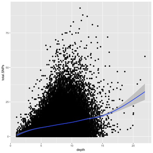
Notice that because both geom_point() and geom_smooth() use the same x and y mapping, we can specify
the aesthetic in ggplot() function.
Discussion
What does this graph tells us about the relationship between depth of sequencing and SNPs?
Challenge 2
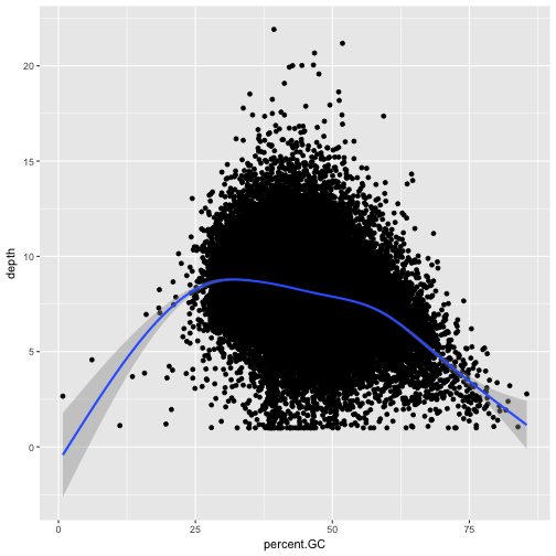
Explore the effect GC content has on depth of sequencing in the dataset.
Solution to challenge 2
ggplot(d, aes(x=percent.GC, y=depth)) + geom_point() + geom_smooth()`geom_smooth()` using method = 'gam'
Binning Data with cut() and Bar Plots with ggplot2
We laready saw how to bin data through the cut() function:
d$GC.binned <- cut(d$percent.GC, 5)
head(d$GC.binned)
[1] (51.6,68.5] (34.7,51.6] (34.7,51.6] (34.7,51.6] (34.7,51.6] (34.7,51.6]
5 Levels: (0.716,17.7] (17.7,34.7] (34.7,51.6] ... (68.5,85.6]
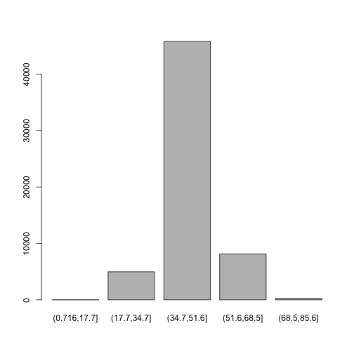
Bar plots are the natural visualization tool to use when looking at count data like the number
of occurrences in bins created with cut(). Last time we used the base graphics to make a bar plot:
plot(d$GC.binned)
Here is how to make a bar plot in ggplot:
ggplot(d) + geom_bar(aes(x=GC.binned))
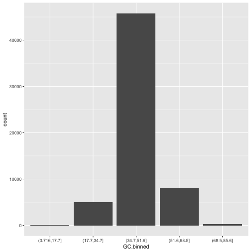
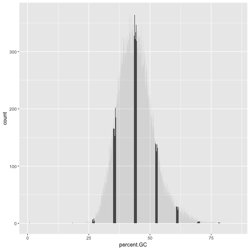
When geom_bar()’s x aesthetic is a factor (e.g., d$binned.GC), ggplot2 will create a bar plot of counts.
However, if geom_bar()’s x aesthetic is mapped to a continuous column (e.g., percent.GC) geom_bar()
will automatically bin the data itself, creating a histogram:
ggplot(d) + geom_bar(aes(x=percent.GC))
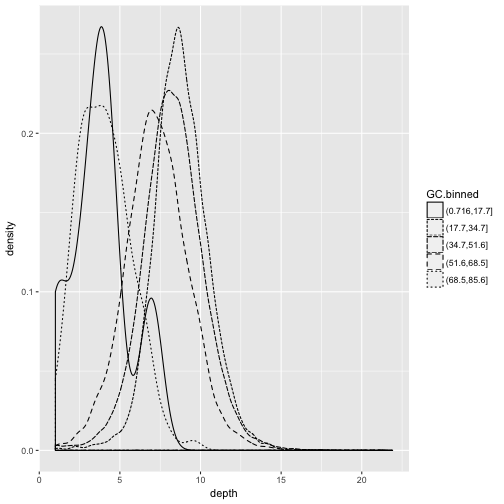
The bins created from cut() are useful in grouping data (a concept we often use in data analysis).
For example, we can use the GC.binned column to group data by %GC content bins to see how GC content
has an impact on other variables. To do this, we map aesthetics like color, fill, or linetype to our GC.binned column:
ggplot(d) + geom_density(aes(x=depth, linetype=GC.binned), alpha=0.5)
Challenge 3: Finding the Right Bin Width
We’ve seen before how different bin widths can drastically change the way we view and understand the data. Try creating a histogram of Pi with varying binwidths using:
ggplot(d) + geom_bar(aes(x=Pi),
binwidth=1) + scale_x_continu ous(limits=c(0.01, 80))
. Using scale_x_continuous() just ignores all windows with 0 Pi and zooms into the figure. Try binwidths of 0.05, 0.5, 1, 5, and 10. What do you observe?Solution to challenge 3
Smaller bin widths can fit the data better (revealing more subtle details about the distribution), but there’s a trade-off. As bin widths become narrower, each bin will contain fewer data points and con‐ sequently be more noisy (and undersmoothed). Using wider bins smooth over this noise. However, bins that are too wide result in oversmoothing, which can hide details about the data. ggplot(d, aes(x=percent.GC, y=depth)) + geom_point() + geom_smooth()
Using ggplot2 Facets
Now we’ll return to the dataset we created (by mergin) in one of our previous lessons. Here is what what we did:
mtfs <- read.delim("https://raw.githubusercontent.com/vsbuffalo/bds-files/master/chapter-08-r/motif_recombrates.txt", header=TRUE)
rpts <- read.delim("https://raw.githubusercontent.com/vsbuffalo/bds-files/master/chapter-08-r/motif_repeats.txt", header=TRUE)
mtfs$pos <- paste(mtfs$chr, mtfs$motif_start, sep="-")
rpts$pos <- paste(rpts$chr, rpts$motif_start, sep="-")
mtfs$repeat_name <- rpts$name[match(mtfs$pos, rpts$pos)]
We will now explore these data using visualization technique known as facets. Facets allow us to visualize grouped data by creating a series of separate adjacent plots for each group. Let’s first glimpse at the relationship between recombination rate and distance to a motif. We’ll construct this graphic in steps:
p <- ggplot(mtfs, aes(x=dist, y=recom)) + geom_point(size=1)
p <- p + geom_smooth(method="loess", se=FALSE, span=1/10)
print(p)
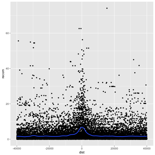
Note that we’ve turned off geom_smooth()’s standard error estimates,
adjusted the smoothing with span, and set the smoothing method to “loess”.
From this data, we only see a slight bump in the smoothing curve where the motifs reside. However, this data is a convolution of two different motif sequences on many different genomic backgrounds. In other words, there’s a large amount of heterogeneity we’re not accounting for, and this could be washing out our signal. Let’s use faceting to pick apart this data.
First, if you’ve explored the mtfs dataframe, you’ll notice that the
mtfs$motif column contains two variations of the sequence motif:
unique(mtfs$motif)
[1] CCTCCCTGACCAC CCTCCCTAGCCAC
Levels: CCTCCCTAGCCAC CCTCCCTGACCAC
One way to compare these is by grouping and coloring the loess curves by motif sequence:
ggplot(mtfs, aes(x=dist, y=recom)) + geom_point(size=1) + geom_smooth(aes(color=motif), method="loess", se=FALSE, span=1/10)
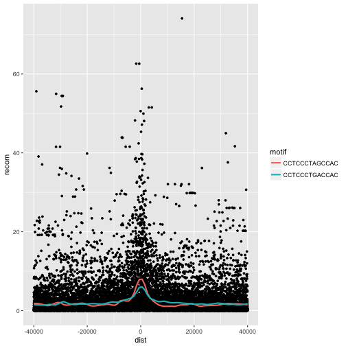
Alternatively, we can split these motifs apart visually with
facets using ggplot2’s facet_wrap():
p <- ggplot(mtfs, aes(x=dist, y=recom)) + geom_point(size=1, color="grey")
p <- p + geom_smooth(method='loess', se=FALSE, span=1/10)
p <- p + facet_wrap(~ motif)
print(p)
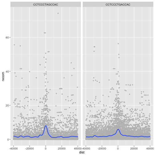
ggplot2 has two facet methods: facet_wrap() and facet_grid().
facet_wrap() takes a factor column and creates a panel for
each level and wraps around horizontally. facet_grid() allows
finer control of facets by allowing you to specify the columns
to use for vertical and horizontal facets. For example:
p <- ggplot(mtfs, aes(x=dist, y=recom)) + geom_point(size=1, color="grey")
p <- p + geom_smooth(method='loess', se=FALSE, span=1/16)
p <- p + facet_grid(repeat_name ~ motif)
print(p)
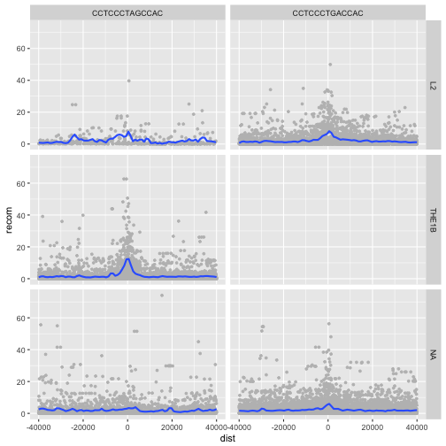
We see some patterns emerging here: motif CCTCCCTAGCCAC on a THE1B repeat background has a strong effect on recombination rate, as does CCTCCCTGACCAC on a L2 repeat background. You can get a sense of the data that goes into this plot with:
table(mtfs$repeat_name, mtfs$motif, useNA="ifany")
        CCTCCCTAGCCAC CCTCCCTGACCAC
  L2              457          4110
  THE1B          4651             0
  <NA>           2908          7924
The tilde (~) used with facet_wrap() and facet_grid()
is how we specify model formula in R. If you’ve used R to
fit linear models, you’ve encountered ~ before. We can
ignore the specifics when using it in facet_wrap() (but
see help(formula) if you’re curious).
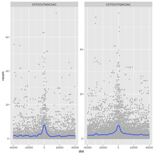
One important feature of facet_wrap() and facet_grid()
is that by default, x- and y-scales will be the same across
all panels. You can set scales to be free with scales=”free_x”
and scales=”free_y”, or scales=”free” to free both axes.
For example:
p <- ggplot(mtfs, aes(x=dist, y=recom)) + geom_point(size=1, color="grey")
p <- p + geom_smooth(method='loess', se=FALSE, span=1/10)
p <- p + facet_wrap( ~ motif, scales="free_y")
print(p)
Challenge 4: Recombination rate by chromosome
Try using facets to look at this data when grouped by chromosome with facet_wrap( ~ chr).
This is a taste of what you can do with ggplot2. RStudio provides a
really useful cheat sheet of the different layers available, and more
extensive documentation is available on the ggplot2 website.
Finally, if you have no idea how to change something, a quick Google search will
usually send you to a relevant question and answer on Stack Overflow with reusable
code to modify!
Key Points
Use
ggplot2to create plots.Think about graphics in layers: aesthetics, geometry, statistics, scale transformation, and grouping.
